Nitro Explorer Charts
Nitro offers a wide variety of charts to select from, including the following:
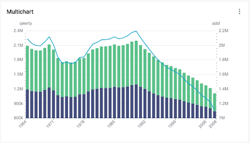
- Multichart - Allows users to overlay different time-series visualizations
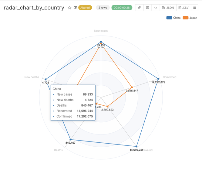
- Radar Chart - Allows users to compare two or more groups over various features of interest
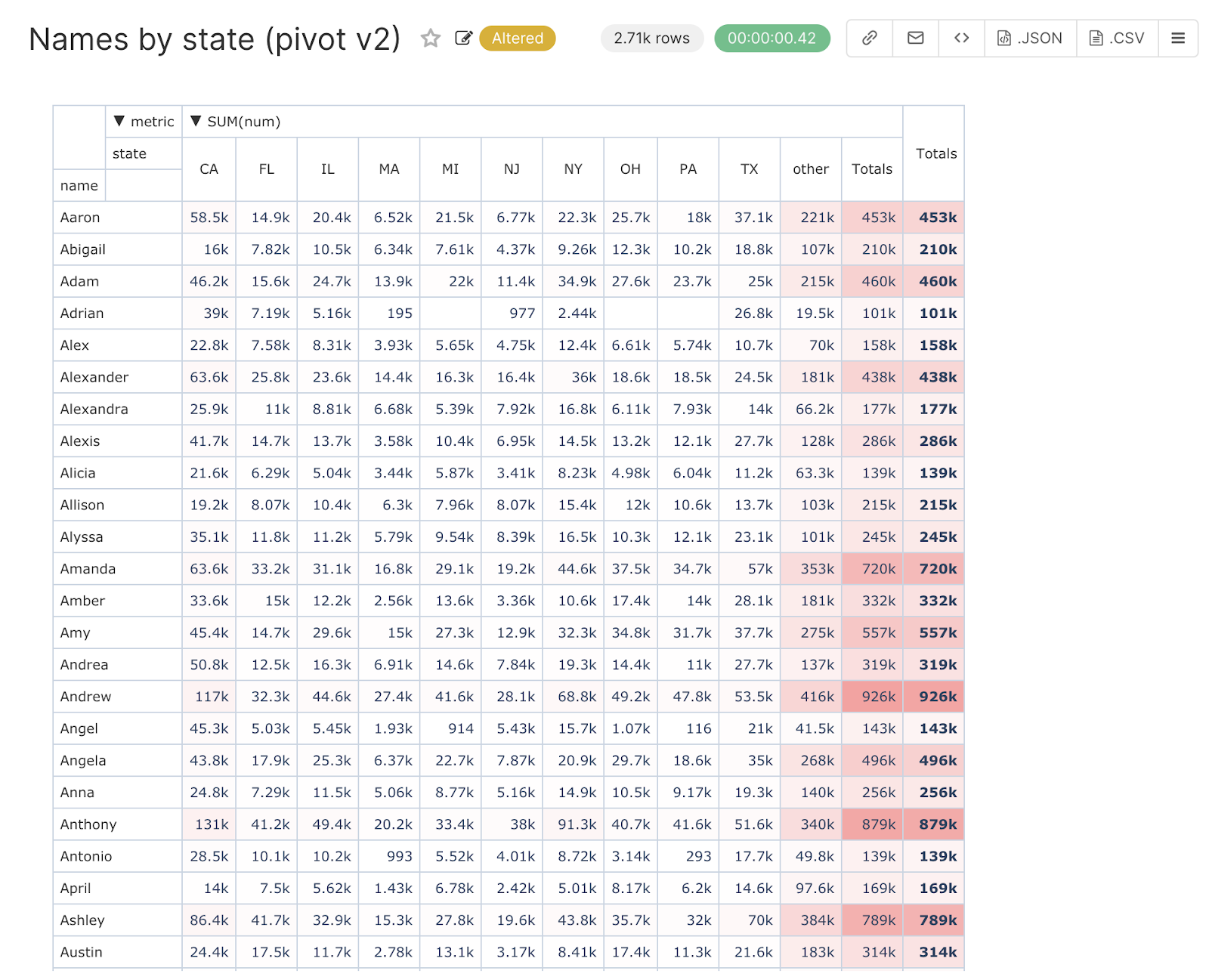
- Pivot Table - Allows users to create a view of selected data in a grid with rows and columns
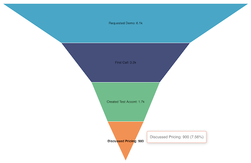
- Funnel Chart - allows users to visualize KPI data
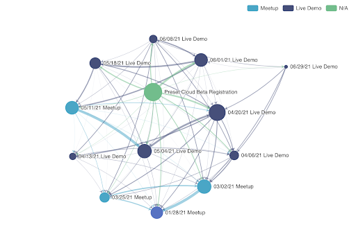
- Force Directed Graph Chart - allows users to visualize data as many-to-many relationships
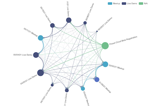
- Circular Graph Chart - allows users to visualize data as a one way flow from an event
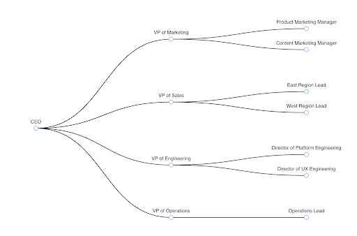
- Tree Chart - allows users to visualize data as a hierarchy, for example, an organizational management tree structure
-
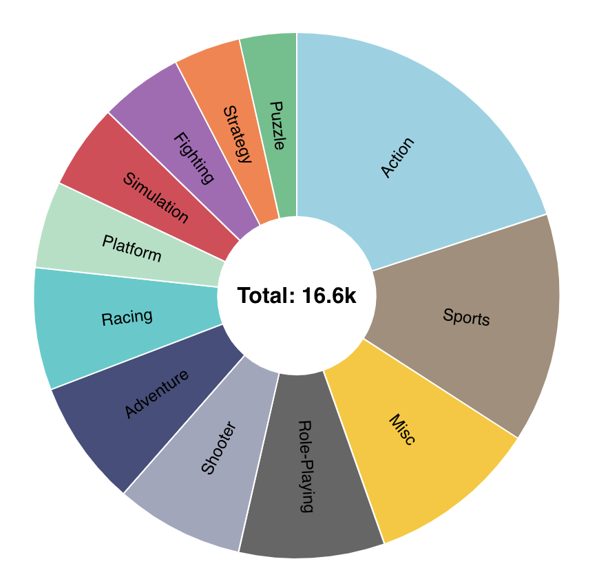
Sunburst Chart - uses circles to visualize the flow of data through different stages of a system.